Designing the GUI for NetTunnel put my creativity to the test. I’ve never actually designed a GUI before, but I’ve seen and read a lot about GUI design theory, but theory seems to be fairly pointless for this design process. It was interesting for me to try to translate the idea in my head to the controls given in Visual Studios.
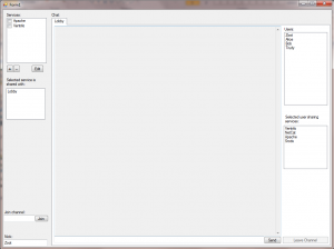
My first attempt ended up like this:


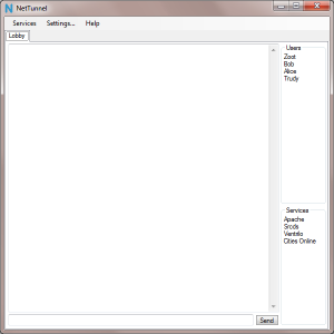
This is okay, but not great. Most of those elements are static elements that don’t move even if you resize it. It’s certainly not something I’d feel comfortable working with every day. After getting lots and lots of advice from friends, my second and final GUI design ended up like so:


A much cleaner and easier to understand layout. Services can be toggled just by clicking on the ‘service’ menu and then clicking on the appropriate service from the drop-down, or they can be toggled within the service window proper. All the most commonly used items in the gui are put in obvious places, while making sure that everything’s just a few clicks away. Everything resizes and can have the size proportions for it changed.
Now that I know how easy it is to create GUIs, I think I might start using them in future projects while retaining a command line version for power users.
Yay! User interfaces! I love these things. Mind if I make some comments? 🙂
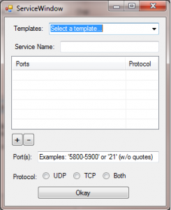
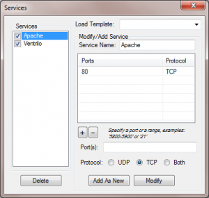
I’m not entirely sure what’s going on in that Services dialog. You have the plus and minus buttons directly under the ports/protocol field, but you’ve also got “Add as New” and “Modify” buttons in the same Modify/Add Service frame. What’s the difference?
There’s also a “Load Template:” dropdown. I assume a template is a saved state of active services and ports, but there’s no indication of how to save a new template.
The window looks slightly cluttered. I dunno how easy it is to align things in Visual Studio, but it might be worth glancing through the Gnome or OS X HIG docs briefly.
http://library.gnome.org/devel/hig-book/stable/design-window.html.en
http://tinyurl.com/ygqlf2o
This may not help at all, but NetworkManager handles a slightly similar situation with VPN networks like so: http://jamesgecko.com/w/var/upload/random/networkmanager.png
The main window is pretty good (can’t get much simpler than that!), but what does the “services” field in the main window do? Does clicking a service open a new tab at the top? If so, how are new tabs closed?
Yes, you can leave comments. I love comments. 🙂
On the services dialog, the plus/minus button and other buttons interact like this: http://img709.imageshack.us/i/servicesarrows.png/ . Or, in words, the plus and minus button add to the ports and protocol list, the other buttons interact with the services list on the left. I couldn’t think of any other way to group the stuff to make the button’s intent clearer, and I’d like to avoid having another dialog involved here. I was hoping that the relative size of the buttons would help users identify what did what, but I’m definitely open to other ideas.
The load template is as you assume, and there’s no way to save templates. You can copy services from the list on the left easily by clicking on it (which fills the controls on the right) and hitting the ‘save as new’ button, so I don’t see a big need for saving templates. Instead, templates are just a way to get users started with their list of services they want to share. I’ll stick some common services in there like Apache, Ventrilo, etc, and hopefully people will get the idea on how to add their own.
Thanks for the links, checked them out and came up with a slightly better looking UI: http://img709.imageshack.us/img709/4857/servicesmodified.png . Don’t think I’ll be able to balance the UI like the apple link suggests easily, but I was able to get more uniform spacing and centering.
Here’s a picture of the services drop down: http://img215.imageshack.us/i/maindropdown.png/ . It’s just any services you’re sharing with a checkbox to quickly enable/disable them. That’s the same checkbox you see in the left of the services dialog.
Thanks again for the comments and suggestions. 🙂
I’d suggest removing the “Add as New” and “Modify” buttons, then placing “New” and “Duplicate” buttons vertically above the “Delete” button. Then add a “Save and close” button in the bottom right hand corner.
(Not sure about the word “Duplicate.” It’s more descriptive than “Copy” (which has copy and paste baggage associated with it), but it would also start with a ‘D’ and be located above “Delete.”)
The change would make things slightly less flexible, but would visually disassociate list management tasks (big picture) from port oriented tasks (smaller picture). And add another button (Nooo!).
===
I’m not sure what to do about the plus and minus buttons. Ideally they’d be grouped together like they are now, but they’re above two fields relevant to adding a new port. Most of the examples I’ve found place the new port stuff in a popup, but you’ve said you want to avoid that.
(Oh, worth noting is that the smaller a button is, the harder it is to click on.)
I found this nifty workaround (http://tinyurl.com/y9lw5kh ), but that example is in a web browser. I think it’d require custom widgets to do natively, which would be a pain (or at least make cross platform compatibility more work :-/ ).
That looks really cool. how does it work, exactly? I understand it uses a kind of UDP trick to bypass the NAT and allow services to expose themselves..
Do you think that you could expose an API to this software that any overlay network software could use? to, for example, dynamically create and destroy tunnels for an f2f network?
It’s using a TCP trick to bypass NAT. The trick is nothing new in itself, see: http://www.mindcontrol.org/~hplus/nat-punch.html
As far as an API, RakNet does a spectacular job of offering an API for hole punching already: http://www.jenkinssoftware.com/